- 1/1
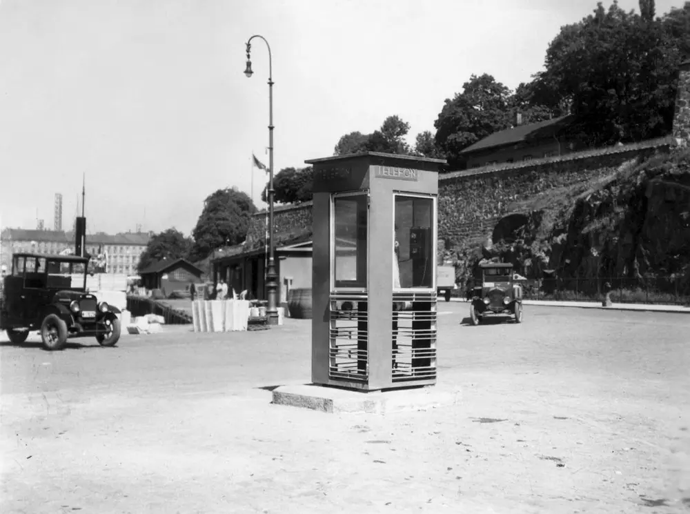
The first red telephone box in Oslo, 1933. Oslo telefonanleggs arkiv/Telemuseet
The most beautiful product of this era, an unheeded invention from the chrome-epoch, of which there are thousands, on every street corner from Rådhusplassen in Oslo to the North Cape .It is the world’s most elegant telephone booth, in bright red and zinc.
”The red telephone booth represents a genuine modernist manifestation, an expression of modern Norway. In addition to its refined architectural qualities, the telephone booth’s distribution all over this country has turned it into a landmark.”
The Norwegian Museum of Architecture by Birgitte Sauge, letter dated 11.11.1998.
”DOCOMOMO (Documentation of Modern Monuments) sees the telephone booth as an architectural icon and as an important expression of Norway’s functionalism. The red telephone booth is also an important representative for 20th century modernism and Norwegian telecommunication.”
DOCOMOMO Norway
This is the story of how Norway’s most important conversation-space was designed by a young, freshly graduated man from Bergen.
”Norwegian architects are hereby invited…”
In the autumn of 1932, Oslo Telefonanlegg initiated an architectural competition. Finally, Oslo would get its own telephone booth. The city had had so called “talking-stations” from 1885, which in turn were overtaken by automatic telephones – only available at selected Narvesen kiosks. The state was of the opinion that now was the time to offer the public a better service; public telephone booths open 24/7, like the ones they already had in Sweden and England. But what would they look like, these new telephone booths? What considerations would it be necessary to take when designing it? The telegraph board developed a detailed list of demands and restraints: “The booth is intended to be placed outside on the streets and squares and need to be designed so that snow and ice does not hinder the opening and closing of the doors,” they wrote. “To prevent vandalism, theft, uncleanliness etc. inside the booth, it needs to be designed so that from all angles one may see what is going on in there.” Additionally, it would need to withstand storms and bad weather, and “preferably also being whipped by rain mixed with seawater”
This was not all: The appearance would have to be «pleasing». The booth also needed to be movable, so that it could be taken in to be serviced at Telegrafverket’s main workshops. The required material was iron, and the surface was to be spray painted – preferably using car-body paint. There was a requirement for “a writing shelf, a pack shelf, and a suitable place for the telephone catalogue.” Also, there would need to be an illuminated TELEFON – sign, easily visible from all four angles. The total cost for each booth should not exceed 1000 kroner. The first prize for coming up with such a product was 800 kroner.
“Norwegian architects are hereby invited to partake in a competition for the design of a telephone booth…”
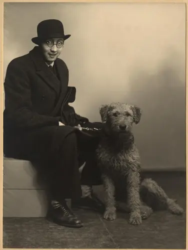
Georg Fredrik Fasting Privat eie
The man with the solution
«At some point in 1932, Georg Fredrik sat at a party in Bergen. Maybe he felt a bit lost and forgotten as he often had throughout his life. He retreated to a quiet corner, took out a pencil and started doodling on a matchbox. According to my mother, this was how the telephone booth came into being.” In the book “Norges lille røde – historien om telefonkiosken,” Lars Fasting describes his father, the man who is far less known than the iconic architectural structure he left behind. Georg Fredrik Fasting was from Bergen, born into a family of working people and smallholders. One unusual facet of Georg Fredrik was that he was born without ears. His mother made sure he learnt to speak, read and write, but Lars Fasting indicates that his father would seek refuge in drawing when the social challenges became too much to bear. And in the end drawing became his profession. In 1924 he secured a guarantor for a student loan, and started studying to become an architect at the NTH. Throughout the 1930s he entered several architectural competitions, with drafts produced, according to his son, “after work and in the late hours of the night.”
His efforts were not wasted. Out of 93 entries, with names such as “Flirt”, “Brrr”, “Ring” and “Amor”, the jury selected Fasting’s submission, “RIKS” as the new telephone booth: “The draft shows a strikingly simple solution to the task, technically as well as aesthetically well worked out.”
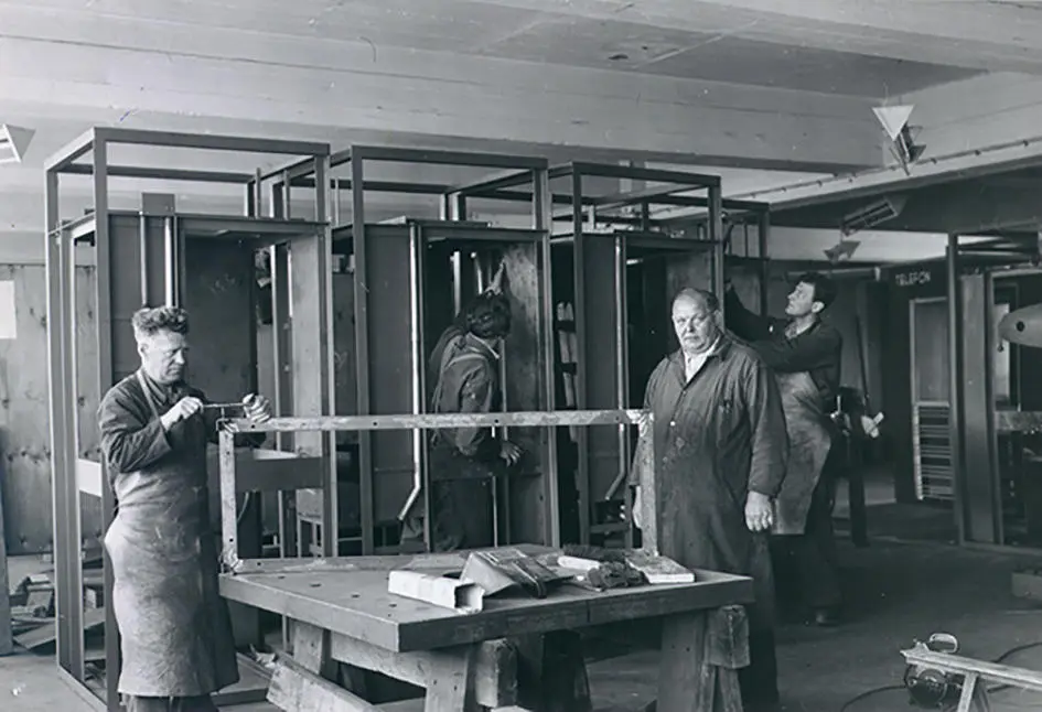
Telephone box production Ukjent/Telemuseet
Taut and provident
Simple and aesthetic are the keywords here. Fasting had designed a booth pointing towards the future, and to modernism. Just how modern it was can be seen by comparing RIKS to the British telephone booth, also designed in the interwar-era. While the British version with its classicistic style is looking back to the heyday of the empire, Fasting’s booth is progressive and functionalistic. Like most Norwegian architects, Fasting broke with the classicistic style of architecture after the Stockholm-exhibition in 1930. “After it, almost all buildings erected in Norway until the German invasion in 1940, were in the functionalistic architectural style,” writes senior curator of architecture at the Norwegian National Museum, Ulf Grønvold, in the book, “Den lille røde”. “The Norwegian booth is a piece of functionalistic architecture, an asymmetric composition with its roof slab overhanging the word TELEFON, in bold sans seraph lettering,” concludes Ulf Grønvold.
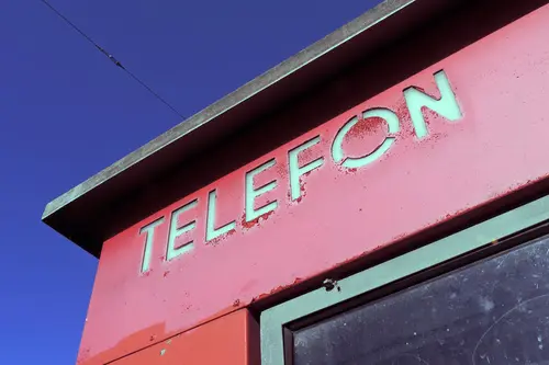
Red telephone box, closeup Cato Normann/Telemuseet
Fashionably red
And it was red. Fasting chose a colour which was part of the modern palette. “A bright red colour, but not as shiny as a signal red, the character of the colour places it among the fashionable colours within functionalism,” states paintings conservator and researcher in NIKU (Norwegian Institute for Cultural Heritage Research), Jon Brænne. In his opinion, Fasting went for visibility without making the booth stand out too much from its surroundings. The original colour was in use up to around 1950, when it changed to signal red. Towards the end of the 1970s the colour was again adjusted towards today’s orangey red.
The design, however, has not changed. RIKS is eighty years and still looks remarkably good. That’s what makes Fasting’s telephone booth a classic – even before it was added to DOCOMOMO’s list over modern icons of design. For Telenor, the telephone booth has served as a pathway into the hearts of the public. For many, Telenor (Televerket) was synonymous with exactly this telephone booth, because this was where one would go to place a call. Having a home phone was not common until the 1980s. As such the red box became part of the Norwegian everyday and consciousness. The symbol- and publicity value of this is hard to evaluate, but in 2007 it was time to give honour where honour was due, Telenor, in consultation with the Directorate for Cultural Heritage, decided to preserve 100 telephone booths for all eternity.
And what about Georg Fredrik Fasting? What happened to him? At the age of 56 an entry in his diary states: «I CAN HEAR». As the first person in the world he had undergone an operation where he had ear canals constructed and eardrums fitted. For the rest of his life, the man behind Norway’s own telephone booth could answer the telephone himself.
Kilde
- Issued by Telemuseet and Telenor Cultural Heritage, Norges lille røde – historien om telefonkiosken. , 2007


